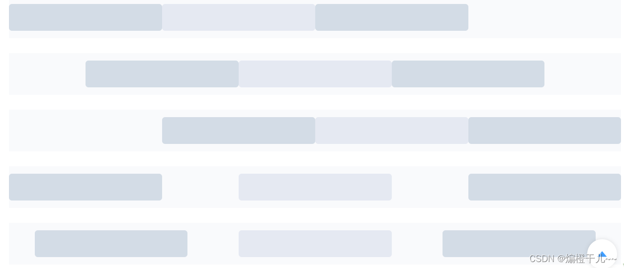
利用el-row的type属性,将type设置为flex,启用flex布局,再设置justify和align属性,即可避免该问题出现。
<el-row type="flex" class="row-bg"><el-col :span="6"><div class="grid-content bg-purple"></div></el-col><el-col :span="6"><div class="grid-content bg-purple-light"></div></el-col><el-col :span="6"><div class="grid-content bg-purple"></div></el-col>
</el-row>
<el-row type="flex" class="row-bg" justify="center"><el-col :span="6"><div class="grid-content bg-purple"></div></el-col><el-col :span="6"><div class="grid-content bg-purple-light"></div></el-col><el-col :span="6"><div class="grid-content bg-purple"></div></el-col>
</el-row>
<el-row type="flex" class="row-bg" justify="end"><el-col :span="6"><div class="grid-content bg-purple"></div></el-col><el-col :span="6"><div class="grid-content bg-purple-light"></div></el-col><el-col :span="6"><div class="grid-content bg-purple"></div></el-col>
</el-row>
<el-row type="flex" class="row-bg" justify="space-between"><el-col :span="6"><div class="grid-content bg-purple"></div></el-col><el-col :span="6"><div class="grid-content bg-purple-light"></div></el-col><el-col :span="6"><div class="grid-content bg-purple"></div></el-col>
</el-row>
<el-row type="flex" class="row-bg" justify="space-around"><el-col :span="6"><div class="grid-content bg-purple"></div></el-col><el-col :span="6"><div class="grid-content bg-purple-light"></div></el-col><el-col :span="6"><div class="grid-content bg-purple"></div></el-col>
</el-row>